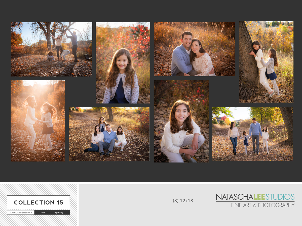
#1: Lots of wall space and you like things uniform:
Here is one example. It uses (8) 12 x 18″ canvas prints, and with a 1 inch gap, that’s a total wall space of 63″ x 31″. This one would work great if you have a good mix of horizontal and veritcal images you like. And, if you are someone who likes things all balanced and square. Well, technically “rectangle” in this case. This display has major WOW factor!
2. Lots of space, but you like things a bit more creative.
In this canvas cluster, there is more variety in each image’s size and the overall layout. This client has their images hanging in their beautifully-lit large foyer, so everyone who enters their home sees it first thing: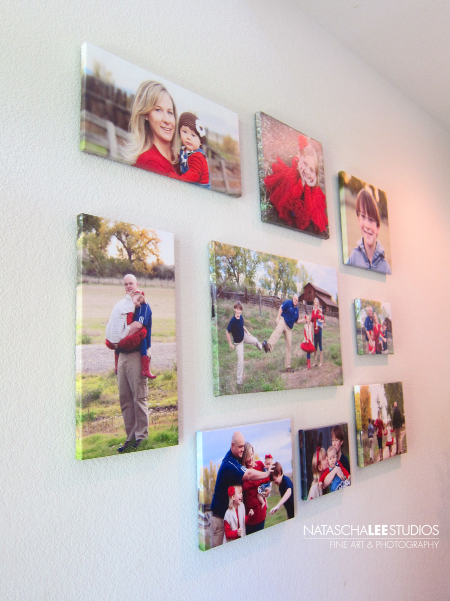
#3 – Simple, modern and elegant.
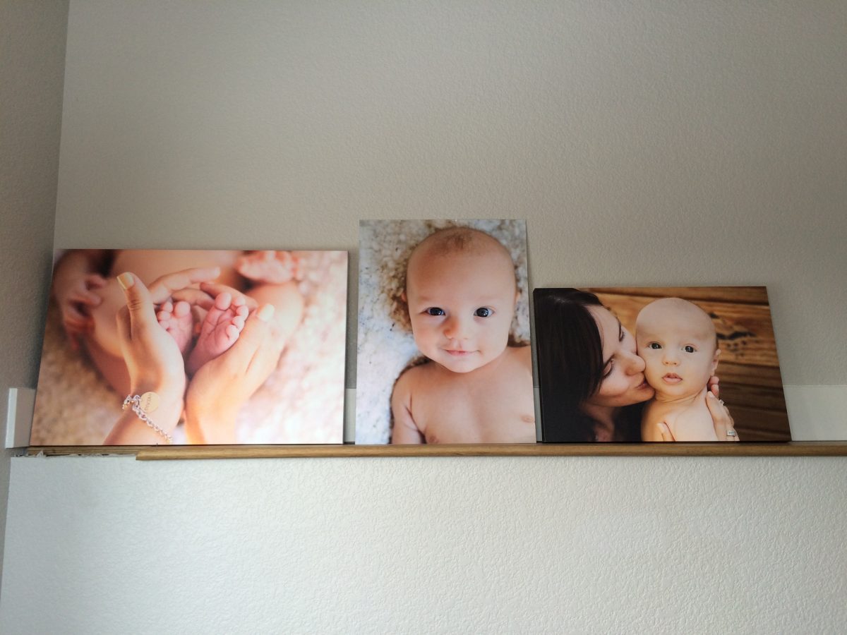
Those terms fit this client perfectly. She has a bright, modern house she designed herself. She picked her favorite images, had large canvases made, and they lean on a ledge in her stairway.#5 – Over the mantle A
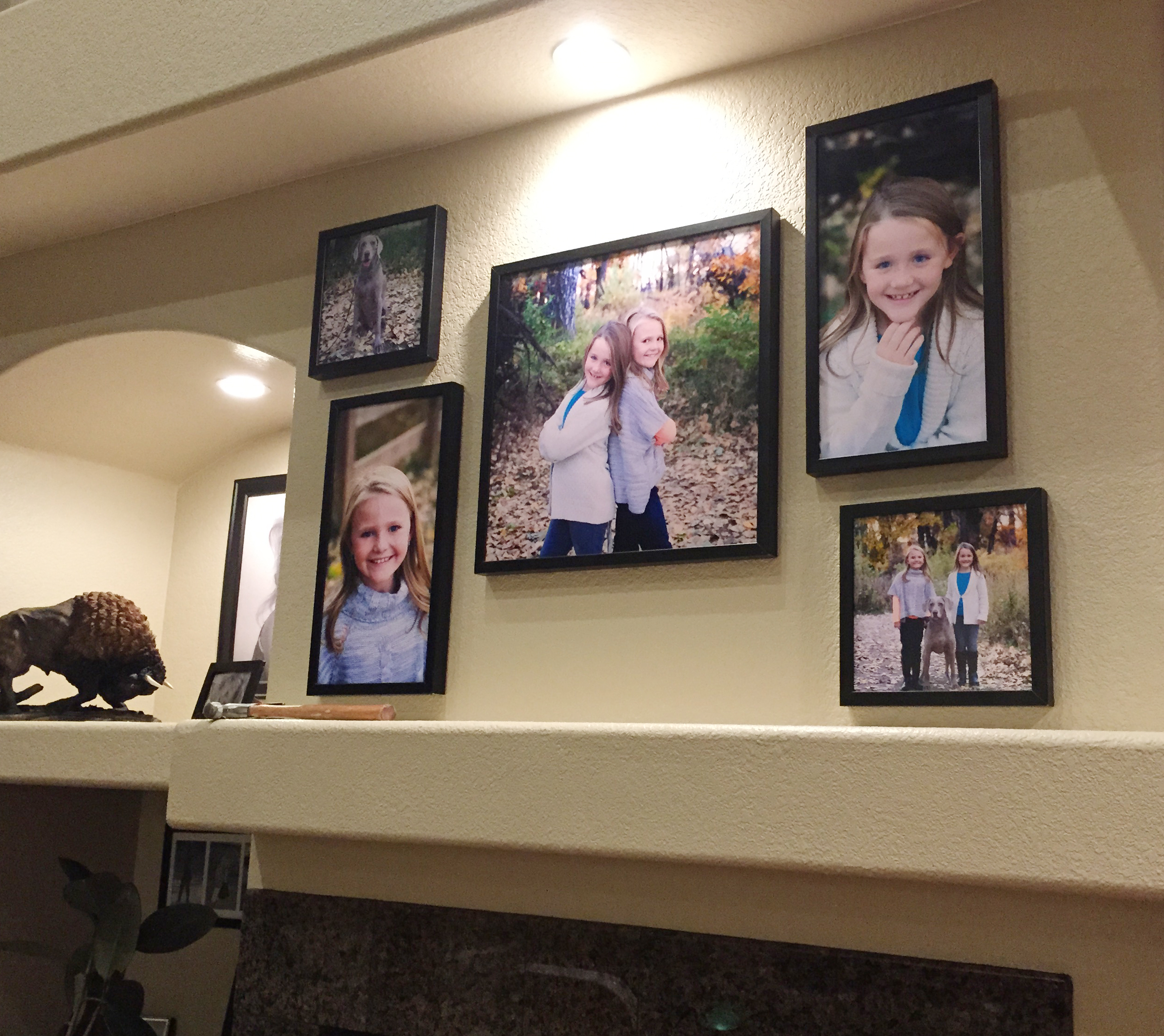
This is a great example of how to hang a wall display/cluster over a mantle. It’s balanced left to right, but has some added visual interest due to the different sizes and shapes. I don’t know if you can tell, but she even put the small squares are just a bit outside of the tall solo images of each girl. That gives it a certain “tension” that adds to the overall visual interest.
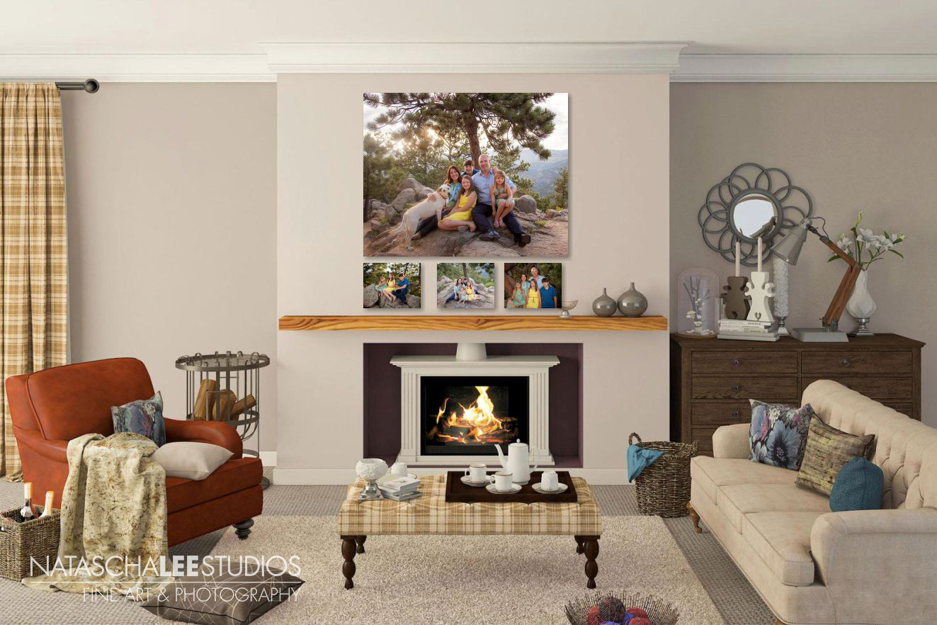
#5 – Over the mantle B (Plus, insight into how we design something you will love, and that will fit your space.)
I help my clients design their wall collections to fit both their personality, their space, and also their favorite images. It’s a blast, and my favorite part is to see them after they have been hung up in their home.
Here is what it looks like when client come in for their viewing session (held 2 weeks after their photo session), and I show them samples of their images in different arrangements. Sometimes the background is photos of their own home, and sometimes we use digital rooms to gets a sense of size and place:
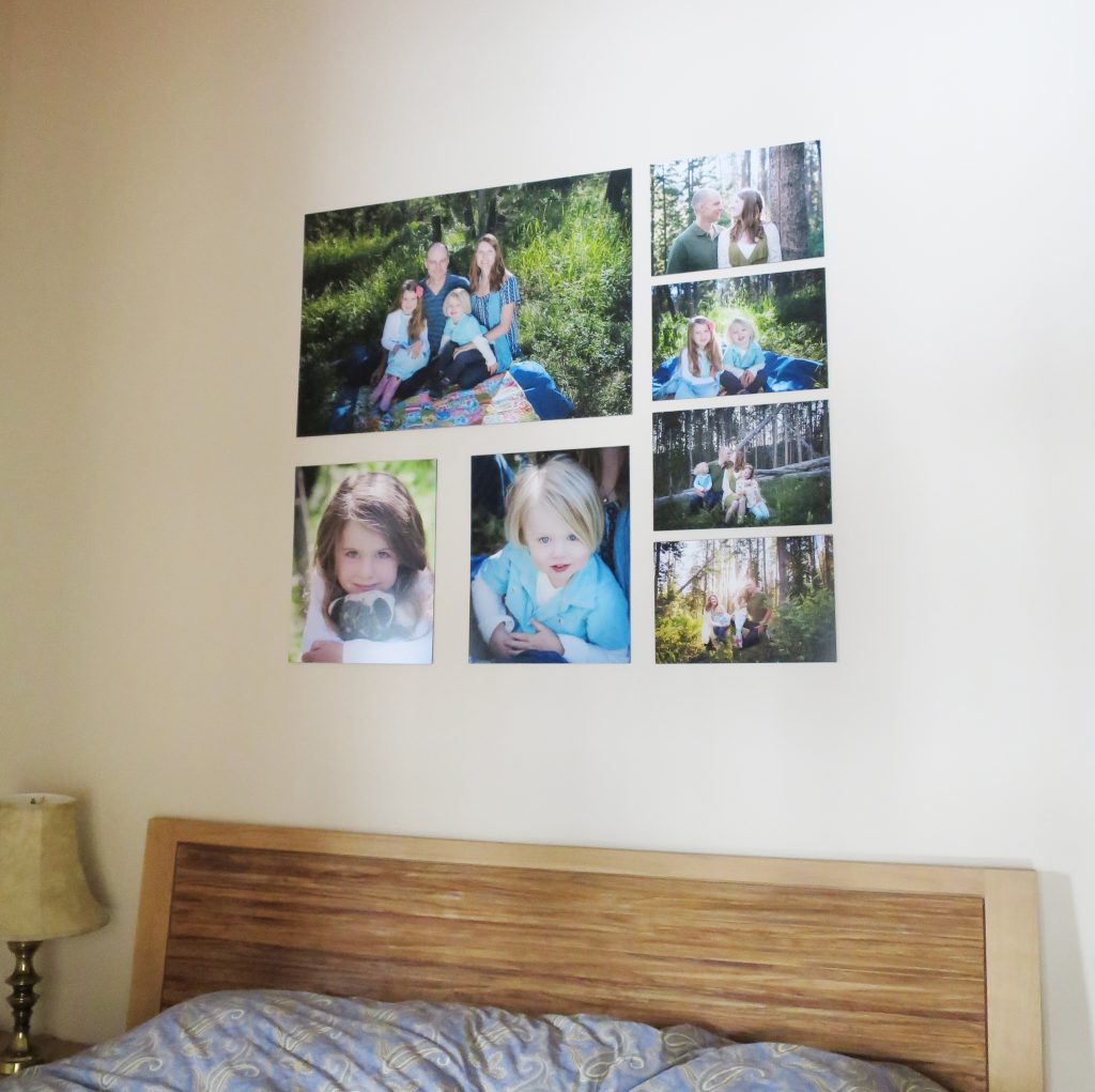
#6 – Above a king bed, with a high ceiling
This client wanted to create a collage on a large wall in the master bedroom of their Fraser condo. You can see how the “mock-up” looked in a digital room, and then how the final product looked in their ski home.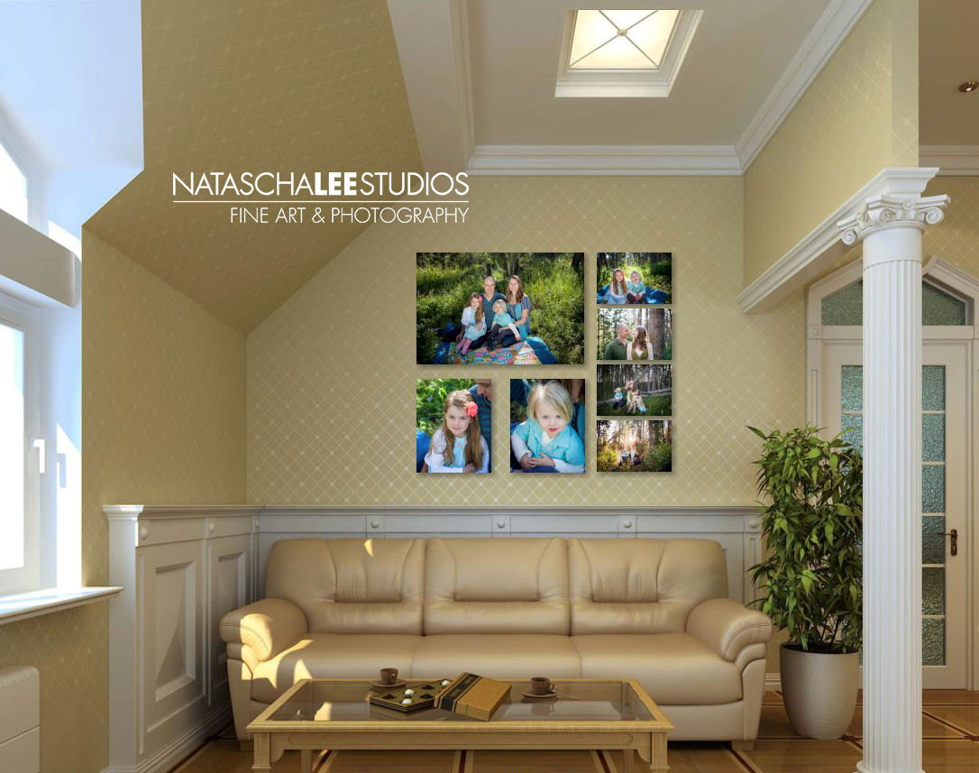
A special thanks to my clients who send me photos of their display after it goes up. (In the image first mantle photo, you can see her hammer is even still in the photo! 😉 It makes me sooo happy to see my art of your family up in your home. And, a suggestion to anyone who hires a professional photographer: send them a photo of their pieces up in your wall, or of your family gathered around the album. It will really make their day!
]]>